Fresh ideas from museums around the globe in your inbox each week

June 01 2026
 By Jim Richardson
From Nike’s “swoosh” symbol to the iconic Apple logo, brands know that a strong identity is essential to their success. The same is true for museum logo design.
Museums have also embraced the power of brand. With the world’s best known institutions building recognition not only with their collections, exhibitions and buildings, but also with strong communications that cut through the noise of our modern media landscape.
The five identities below show different ways to connect a museum’s visual language with its purpose. They span London, Brooklyn, Toledo and the Netherlands, with launches in 2023 and 2024. Our wider museum branding examples explore how an identity extends beyond the logo.

London Museum: a recognisable city character
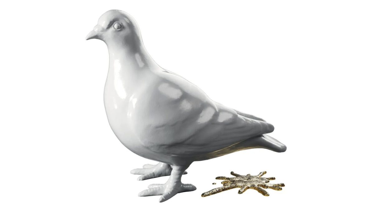
London Museum (formerly known as Museum of London) introduced a new logo in 2024 featuring a porcelain pigeon and a glittery poo splat. The director of the museum, Sharon Ament, said the pigeon and splat represented the “grit and glitter” of the capital.
The museum turned to 500 Londoners and tourists to get their thoughts and to inform the work through focus groups, workshops and surveys. The museum said that this process affirmed their founding principles, “We are here to enhance the understanding and appreciation of London and all its people – past, present, future”.
The new museum logo itself was designed by Uncommon Creative. Nils Leonard, from the studio said, “We wanted more than a new identity for this amazing museum, we wanted to find a new icon for London itself. Something honest, something remarkable.”
Want more insights like this? Explore our upcoming virtual conferences here
Brooklyn Museum: punctuation with history
The Brooklyn Museum revealed a striking new logo in September 2024 to mark its bicentennial year. The rebranding process involved more than a year of audience research and essential discussions with staff and key stakeholders in order to marry the institution’s rich history with a contemporary vision.

The refreshed museum logo features a modern sans serif typeface. The designers have introduced an intriguing element here: two dots bookending the logo, inspired by the punctuation framing the names of ancient thinkers on the building’s facade. This subtle nod to the museum’s literary roots (it began as a library) adds depth to the visual narrative.
The new design system showcases remarkable flexibility. The dots serve multiple functions, from motion graphics to textual elements, and can even be replaced with symbols or illustrations. A particularly clever touch is the interlocking of the double ‘O’s in ‘Brooklyn’ and the merging of ‘M’s and ‘U’s in ‘Museum’, creating a visually engaging logotype that speaks to the institution’s multifaceted nature.
Natural History Museum: an identity in motion
The Natural History Museum began rolling out its new identity on 19 July 2023. The new logo features a circular formation of the letters NHM, it represents the energy of a ripple effect, which pulsates from the centre to form a three-colour sunburst. It’s a shape born from nature— embodying the collective energy and positivity that reflects the Museum’s mission to become an agent for change.

The Museum’s Head of Marketing Richard Orr and Head of Public Space Programme Lucy Clark spearheaded the work. Richard says: “With a bolder and more contemporary voice the new brand positioning can better engage both existing and new audiences and help us highlight how the Museum is finding solutions to the urgent issues that face our planet.”

Put these ideas into practice! Our virtual conferences are designed to help museum professionals do exactly that. Find out what’s on
Toledo Museum of Art: a flexible visual system
In March 2024, the Toledo Museum of Art (TMA) launched a fresh new logo featuring a dynamic, multifaceted icon.
The redesign spanned from on-campus to online. All elements are inspired by transformation, with a logo system, adaptive colour palette, and symbolism recalling pride for the community and Toledo’s history as “The Glass City.” The logo portrays the continual reframing of art history and evokes the dynamism of emerging futures.


Wereldmuseum: linking a museum network
The shared Wereldmuseum name launched on 4 October 2023. It followed the 2014 merger of Tropenmuseum, Afrika Museum and Museum Volkenkunde, and their partnership with Wereldmuseum Rotterdam from 2017. The name and identity expressed an existing network’s shared purpose rather than marking a new four-way merger.
In order to create some unity and a more consolidated look and feel, Wereldmuseum enlisted the help of Wieden+Kennedy Amsterdam’s design studio to update the branding.

The new museum logo is adaptable so it can be used easily both offline and digitally, and motion design is used to “reflect the diversity of the audience and different exhibition subject matters”.

What to test in a museum logo
A logo has to work well beyond its launch image. Compare how each identity behaves on a small social profile, a busy exhibition poster and a sign that visitors need to read at a distance. The strongest lesson in these examples is the relationship between the symbol, the museum’s purpose and the system that helps staff use it consistently. Start by developing a museum brand identity before deciding which visual ideas to borrow.
–
Our virtual conferences are one of the most affordable ways to stay at the forefront of museum practice. Explore our upcoming events here
About the author – Jim Richardson
Jim Richardson is the founder of MuseumNext. He has worked with the museum sector on digital and innovation projects for almost thirty years and now spends his time championing best practice through MuseumNext.